December 17th, 2025
11 Best Big Data Visualization Tools: Features and Pricing in 2025
By Simon Avila · 31 min read
After testing the leading big data visualization tools across business projects, these 11 stood out for usability, visual quality, and overall value in 2025.
11 Best big data visualization tools: At a glance
Some big data visualization tools focus on interactive dashboards for executive reporting. Others prioritize code-based customization or AI-powered chart generation. Each one offers a different mix of features, pricing, and flexibility. Here's how the top 11 compare:
Tool | Best For | Starting Price (billed annually) | Key Strength |
|---|---|---|---|
AI-powered charts and visual reporting | Natural language queries with automatic chart generation | ||
Interactive dashboards and enterprise reporting | Drag-and-drop visuals with deep customization | ||
Business dashboards within Microsoft environments | Tight integration with Excel, Azure, and Teams | ||
Marketing and web analytics reporting | Free | Direct connection to Google Analytics and BigQuery | |
Self-service data exploration | $200/month for 10 users | Associative data engine for flexible filtering | |
Custom web-based visualizations | Free | Full control over every visual element | |
Simple embedded charts for websites | Free | Lightweight setup with minimal coding | |
Interactive charts for developers | Responsive charts that work across devices | ||
Dashboard components for applications | $1,899/year for 5 developers | 100+ chart types with export options | |
Embedded analytics for products | White-label dashboards for SaaS platforms | ||
Small business reporting | $48/month for 5 users (Cloud) | AI assistant with a drag-and-drop interface |
1. Julius: Best for AI-powered charts and visual reporting
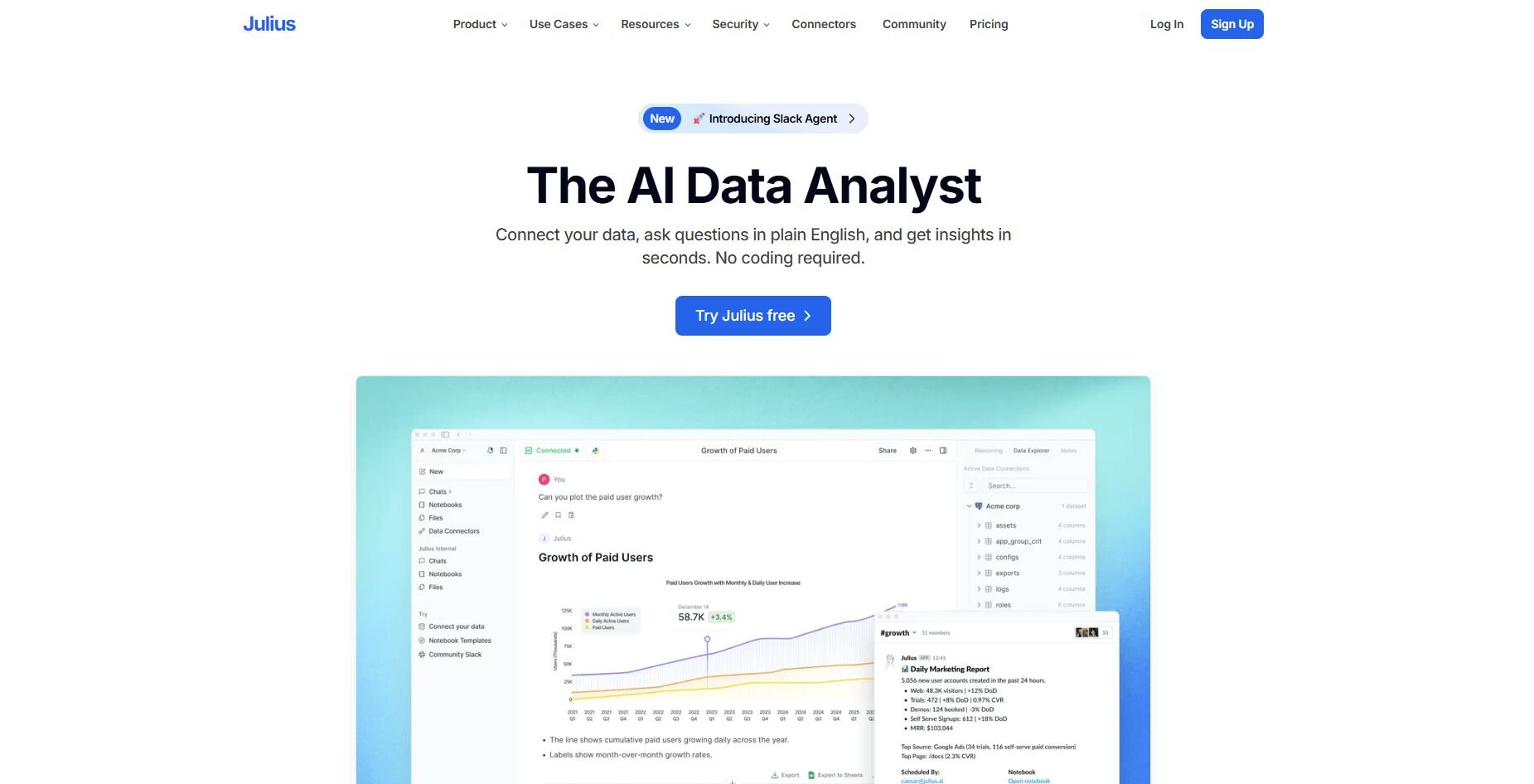
What it does: Julius is an AI-powered data analysis tool that turns raw data into charts, graphs, and summaries through natural language. You can ask questions like "Show monthly revenue by region," and Julius writes the query, pulls the data, and builds the visualization.
Who it's for: Business teams that need visual reports from connected data sources without writing SQL or building dashboards manually.
Julius makes data visualization accessible for teams that work with numbers daily but don't have time to learn complex BI platforms. After connecting your data sources (Postgres, Snowflake, BigQuery, Google Ads, or uploaded files), you can ask questions in plain English and get charts back quickly.
What sets Julius apart from traditional big data visualization tools is how it handles the entire workflow. We designed it so you don't have to drag fields onto a canvas or configure chart settings. You describe what you want to see, and Julius figures out which tables to query, how to aggregate the data, and which chart type fits the result.
Notebooks let you save analyses and schedule them to run automatically. This helps when you need weekly sales charts or monthly campaign reports that update without manual work. With each query, Julius gets better at understanding where your data lives and how your tables connect, so answers get faster and more precise the more you use it.
You can export visuals as PNG, PDF, or CSV files and share them directly with teammates.
Key features
Natural language visualization: Describe charts in natural language and receive visual results
Connected data sources: Integrates with Snowflake, BigQuery, Postgres, Google Ads, and Google Drive
Automatic chart selection: Julius picks the right chart type based on your data and question
Notebooks for scheduled reports: Save and automate recurring visualizations
Smarter over time: With each query, Julius gets better at understanding where your data lives and how your tables connect, so answers get faster and more precise the more you use it
Pros
Fast setup for non-technical users
Handles query writing and chart building together
Repeatable reports through Notebooks
Cons
Limited for highly customized or code-based visuals
Works best with structured, connected data sources
Pricing
Julius plans start at $37 per month.
Bottom line
Julius helps teams create data visualizations through conversation instead of configuration. It's practical for business reporting and trend tracking, but if you need pixel-level control over chart design, D3.js or Highcharts might fit better.
2. Tableau: Best for interactive dashboards and enterprise reporting
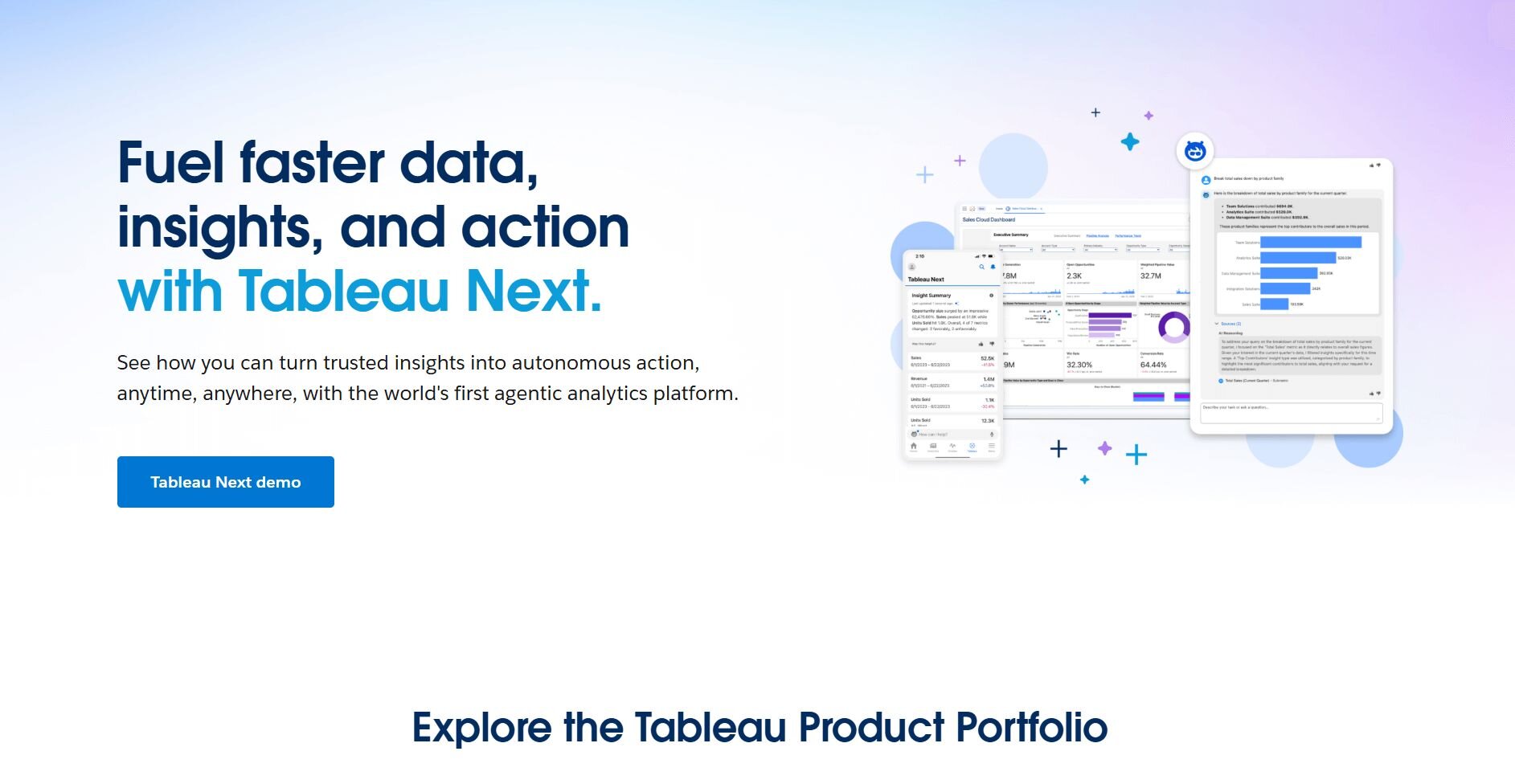
What it does: Tableau connects to databases, spreadsheets, and cloud platforms to build interactive dashboards. Users drag fields onto a canvas to create charts, then combine them into shareable reports.
Who it's for: Analysts and business teams that need polished dashboards for executive presentations or cross-department reporting.
I used Tableau for years to build performance dashboards that tracked sales, marketing spend, and customer metrics. The drag-and-drop interface made creating basic charts simple, and the depth of customization let me build complex calculated fields when needed.
Setting up data connections took time upfront, especially when joining multiple sources. But once everything was linked, updating visuals was straightforward. Dashboards refreshed automatically when source data changed, which saved hours during weekly reviews.
Tableau handles large datasets well, though performance can slow when dashboards include too many complex calculations. Publishing to Tableau Cloud made sharing easy, and viewers could interact with filters without needing their own licenses.
Key features
Drag-and-drop canvas: Build charts by placing fields directly onto the workspace
Calculated fields: Create custom metrics and logic within dashboards
Dashboard interactivity: Add filters, parameters, and drill-downs for viewers
Pros
Strong visual customization options
Handles large datasets reliably
Active community with free templates
Cons
Steep learning curve for advanced features
Expensive for small teams
Pricing
Bottom line
3. Microsoft Power BI: Best for business dashboards within Microsoft environments
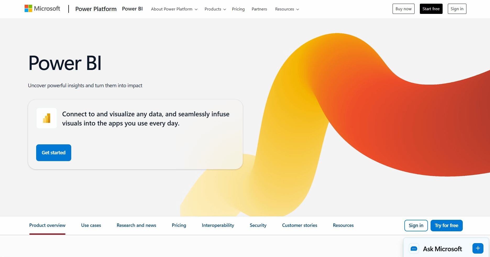
What it does: Power BI transforms data from Excel, Azure, and hundreds of other sources into interactive reports and dashboards. It uses a drag-and-drop interface with DAX formulas for custom calculations.
Who it's for: Teams already using Microsoft 365 that want dashboards integrated with their existing tools.
I tested Power BI on a project that combined sales data from Excel with marketing metrics from Azure. The connection to Microsoft products was smooth, and building basic dashboards took less time than expected.
Power BI's strength is how naturally it fits into Microsoft workflows. Reports embed directly into Teams channels, and scheduled refreshes pull updated data from connected sources automatically. The mobile app made it easy to check dashboards during meetings.
DAX formulas added flexibility for custom metrics, though the syntax took time to learn. Performance stayed solid with moderate datasets, but complex reports with multiple visuals sometimes lagged during filtering.
Key features
Microsoft integration: Connects directly with Excel, Azure, Dynamics, and Teams
Natural language Q&A: Ask questions in plain English to generate quick visuals
Real-time dashboards: Stream live data for up-to-the-minute reporting
Pros
Affordable compared to Tableau
Strong mobile experience
Frequent feature updates
Cons
DAX learning curve for advanced users
Can slow with very large datasets
Pricing
Power BI Pro starts at $14 per user per month.
Bottom line
Power BI delivers strong interactive dashboards at a lower price than Tableau, with tight integration into Microsoft 365. If you'd rather skip learning DAX for custom reports, Julius creates visuals through plain language instead.
4. Looker Studio: Best for marketing and web analytics reporting
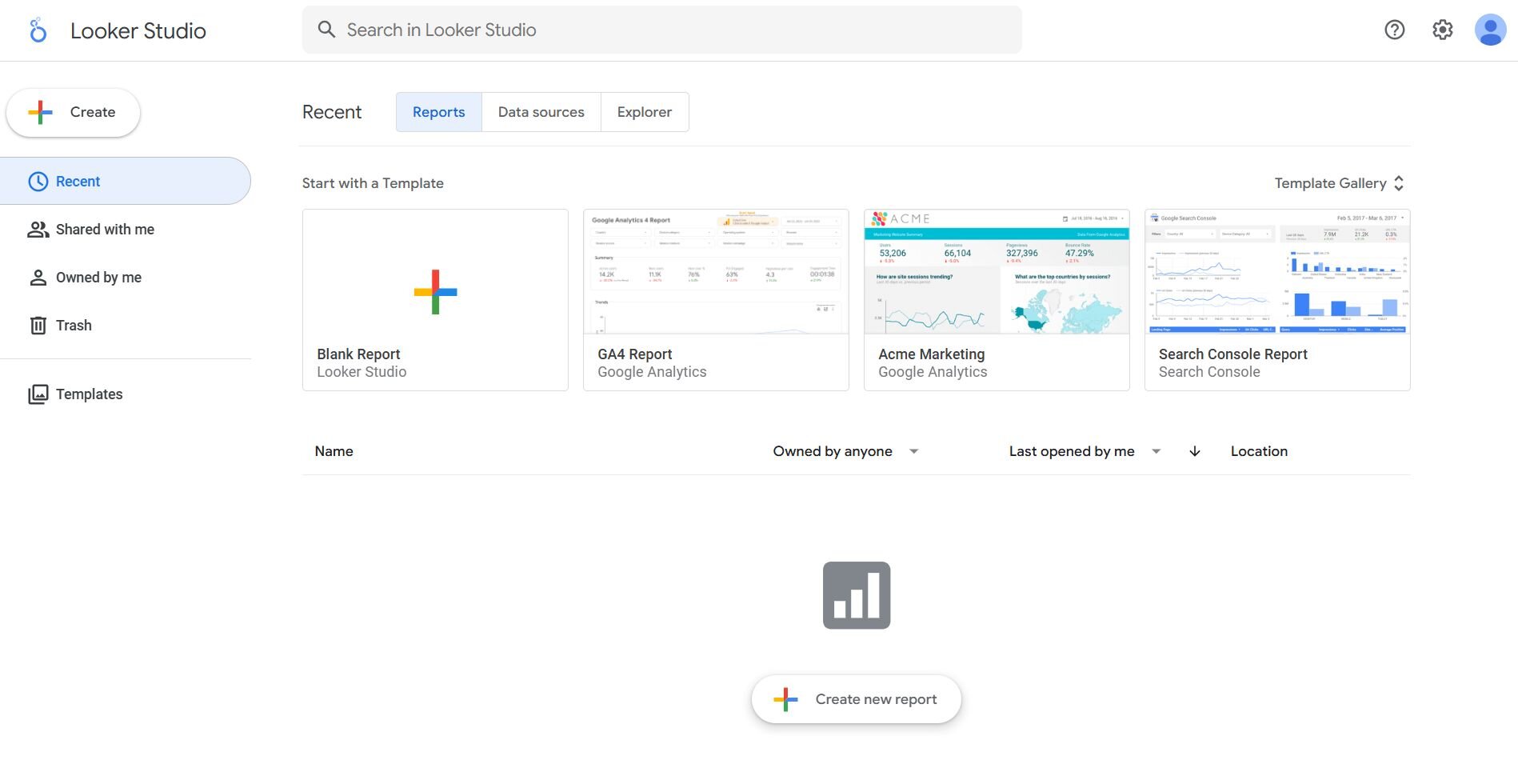
What it does: Looker Studio creates free dashboards that connect to Google Analytics, BigQuery, Google Sheets, and hundreds of partner sources. Reports update automatically and can be shared via link.
Who it's for: Marketing teams that track campaign performance, website traffic, and ad spend across Google products.
I used Looker Studio to build marketing dashboards that pulled data from Google Analytics, Google Ads, and BigQuery. Setup was fast since authentication happened through my Google account, and templates helped me get started without building from scratch.
The drag-and-drop editor worked well for standard charts, though customization options were limited compared to Tableau or Power BI. Blending data from multiple sources required careful field matching, and complex joins sometimes produced unexpected results.
Sharing was simple since reports lived in Google Drive. Stakeholders could view live dashboards without accounts, which made client reporting easier. Performance occasionally lagged with large datasets or many calculated fields.
Key features
Google ecosystem integration: Native connections to Analytics, Ads, and BigQuery
Free access: No per-user licensing costs
Shareable links: Send live reports to anyone without requiring accounts
Pros
Free with no user limits
Easy setup for Google data sources
Good template library
Cons
Limited chart customization
Can struggle with complex data blending
Pricing
Looker Studio is free to use.
Bottom line
Looker Studio is a strong choice for marketing teams using Google tools who need free, shareable reports. For deeper customization or data sources outside the Google ecosystem, Tableau or Julius offer more flexibility.
5. Qlik Sense: Best for self-service data exploration
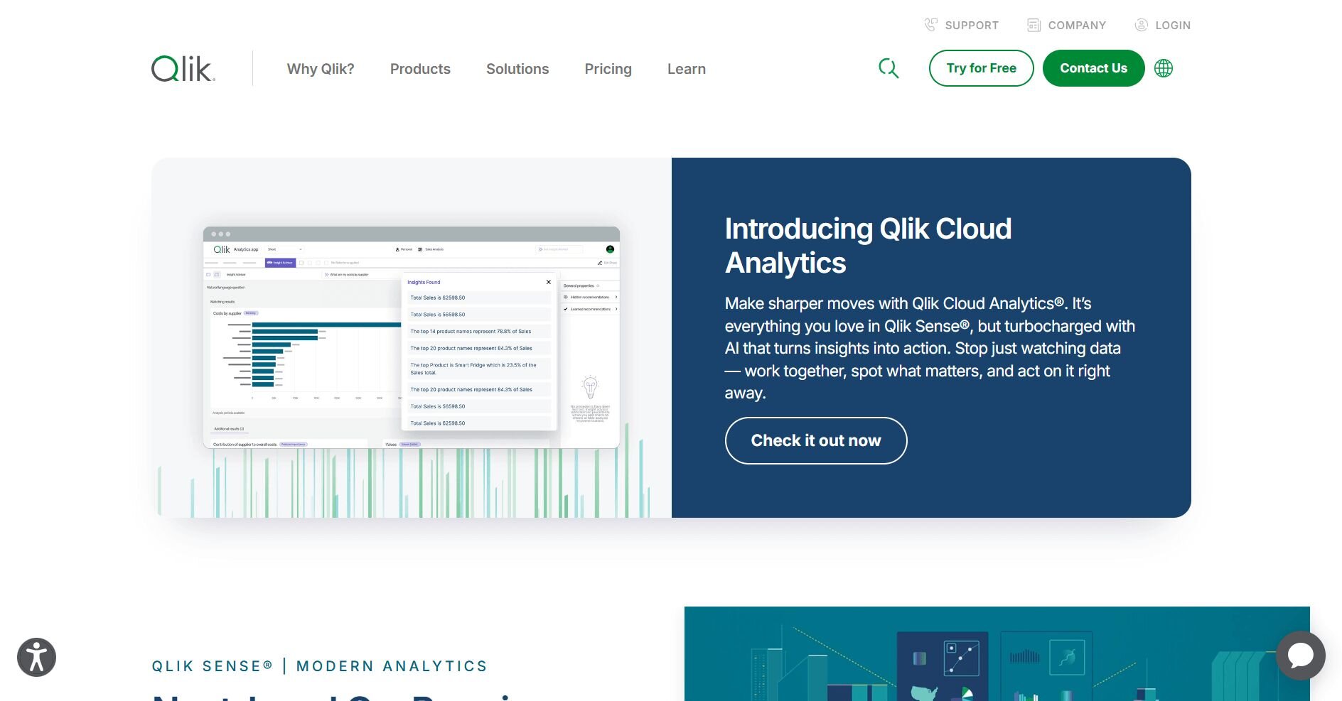
What it does: Qlik Sense uses an associative data engine that lets users explore connections across datasets without predefined queries. Clicking any value filters the entire dashboard to show related data.
Who it's for: Analysts who need to explore data freely and uncover relationships that traditional dashboards might miss.
Qlik Sense's associative engine stood out immediately when I was testing it on a project that joined customer data with transaction history and support tickets. Clicking a customer segment filtered every chart at once, and I could see which products, regions, and support issues connected to that group.
Building visualizations took longer than in Tableau since the interface required more setup. But the exploration payoff was worth it for discovery work. I found patterns I wouldn't have noticed in a static dashboard.
Qlik Sense handled large datasets well, though complex associative models needed careful planning to avoid performance issues. The learning curve was steeper than other tools, but the flexibility made it valuable for investigative analysis.
Key features
Associative engine: Click any data point to filter everything connected to it
Smart search: Find data across all fields using natural language
Self-service creation: Business users can build their own visualizations
Pros
Powerful for exploratory analysis
Handles complex data relationships
Good mobile support
Cons
Steeper learning curve
Higher cost than Power BI
Pricing
Qlik Sense Business starts at $200 per month for 10 users.
Bottom line
Qlik Sense shines when you need to explore data and find unexpected connections. For straightforward reporting or AI-generated charts, Tableau or Julius might be faster to set up.
6. D3.js: Best for custom web-based visualizations
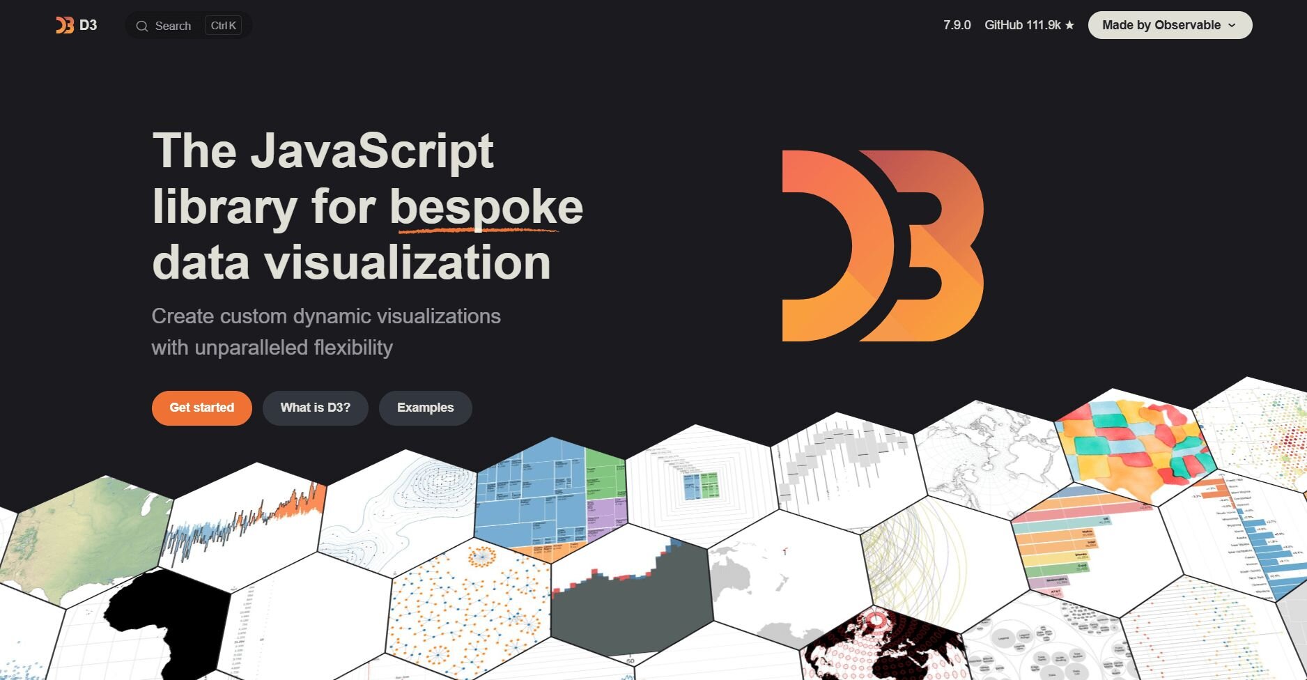
What it does: D3.js is a JavaScript library that binds data to web elements and applies transformations. Developers use it to build custom charts, maps, and interactive graphics that standard tools can't create.
Who it's for: Developers and data journalists who need complete control over visual design and interactivity.
I used D3.js to build custom visualizations for a client project that required animated transitions and non-standard chart types. No other tool offered the same level of control over every pixel, color, and motion.
The trade-off was time. Building a single interactive chart took hours compared to minutes in Julius and Tableau. D3 requires solid JavaScript knowledge and an understanding of SVG, HTML, and CSS. There's no drag-and-drop interface, and debugging can be frustrating.
For unique, publication-quality visuals, D3 is a great choice. But for everyday business reporting, the development time rarely makes sense.
Key features
Complete customization: Control every visual element through code
Data binding: Connect datasets directly to DOM elements
Animations and transitions: Build smooth, interactive visual effects
Pros
Unlimited design flexibility
Active community with examples
Free and open source
Cons
Requires JavaScript expertise
Time-intensive for simple charts
Pricing
D3.js is free to use.
Bottom line
D3.js gives developers full control over data visualization, but the learning curve is steep, and development can take hours. If you need fast business charts without coding, Julius or Looker Studio will save significant time.
7. Google Charts: Best for simple embedded charts for websites
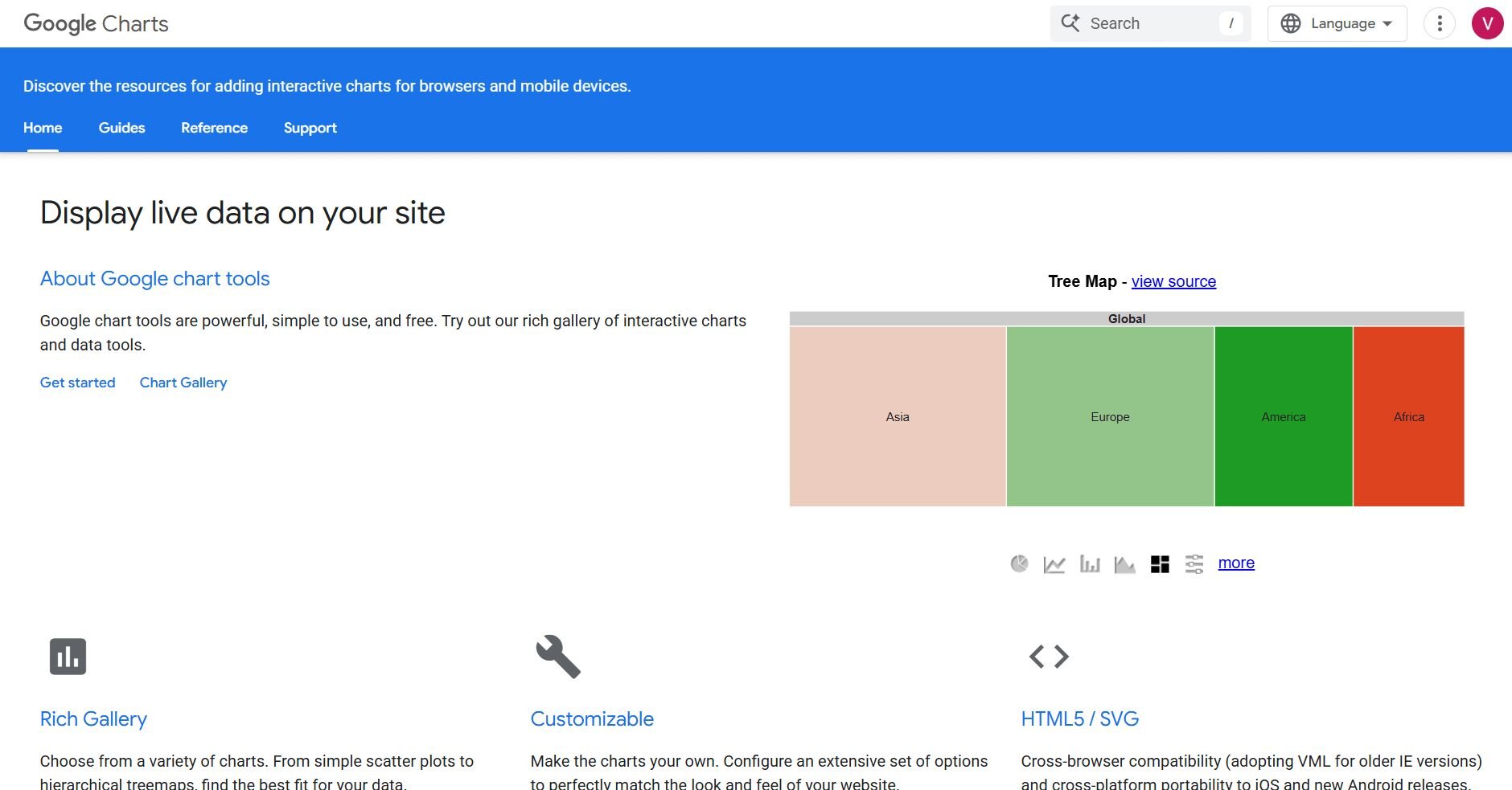
What it does: Google Charts is a free JavaScript library that renders interactive charts in web browsers. It handles common chart types like bar, line, pie, and scatter with minimal setup.
Who it's for: Web developers who need lightweight, responsive charts embedded in websites or applications.
Google Charts worked well when I tested it on a project that needed basic performance metrics displayed on a client portal. Setup was fast since the library loaded directly from Google's servers, and the documentation covered most common use cases.
Chart options were limited compared to D3 or Highcharts, but for standard visuals, everything worked smoothly. The charts rendered quickly and looked clean across devices. Customization was possible but required more effort for anything beyond default styles.
Google Charts works well for dashboards that don't need heavy interactivity or complex data handling. It's practical for displaying summaries without adding significant page weight.
Key features
Lightweight library: Loads quickly without large dependencies
Common chart types: Covers bar, line, pie, geo, and scatter charts
Cross-browser support: Works consistently across modern browsers
Pros
Free with no licensing
Simple API for basic needs
Reliable performance
Cons
Limited customization depth
Fewer chart types than competitors
Pricing
Google Charts is free to use.
Bottom line
Google Charts handles simple visualization needs without complexity. For richer interactivity or business reporting, Highcharts or Julius might offer more flexibility.
8. Highcharts: Best for interactive charts for developers
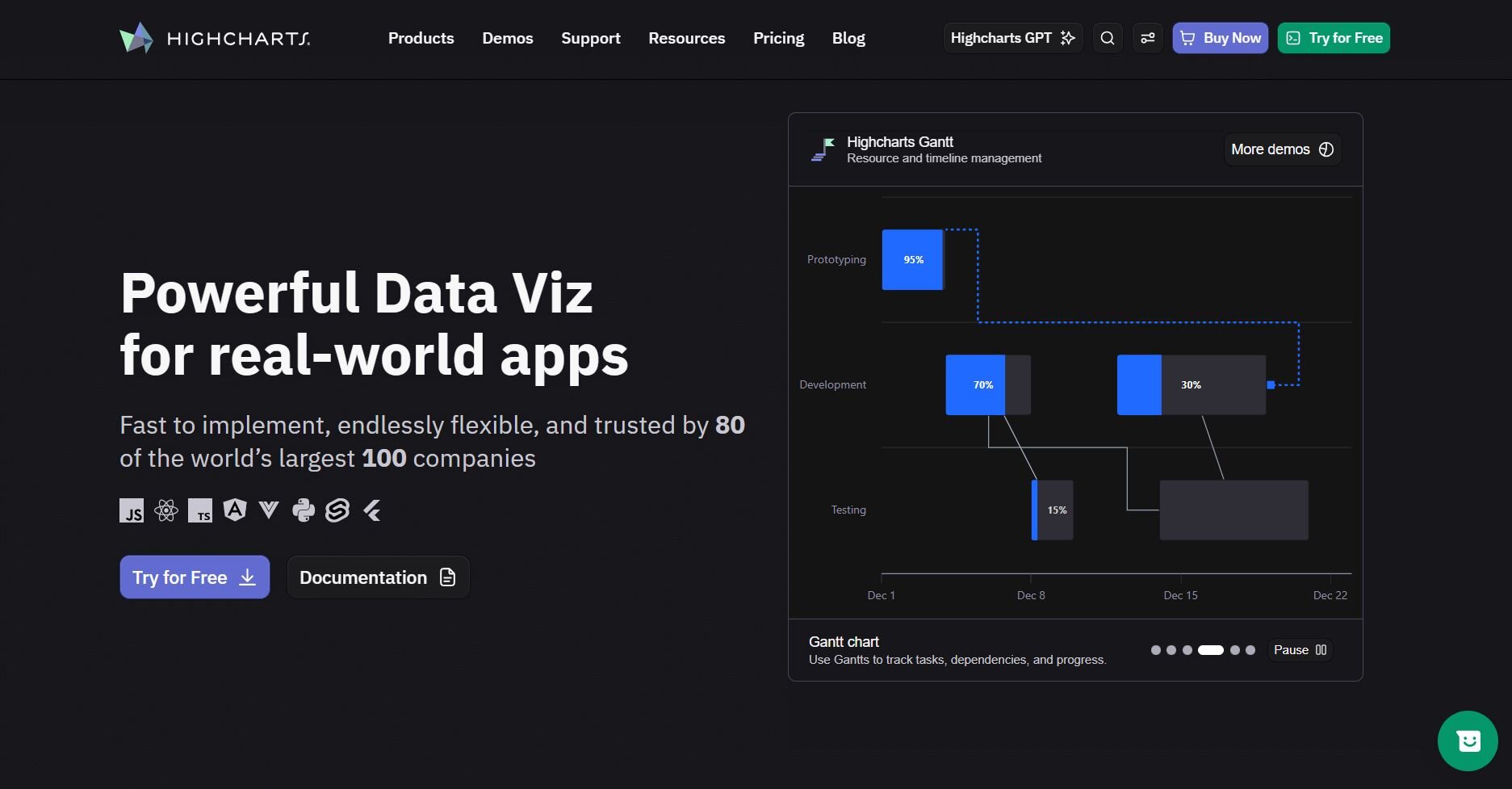
What it does: Highcharts is a JavaScript charting library that creates responsive, interactive charts for web applications. It supports dozens of chart types and offers extensive customization through configuration options.
Who it's for: Development teams building dashboards or data-rich applications that need polished, interactive visuals.
I used Highcharts to build customer-facing dashboards that needed to look professional and respond smoothly to user interactions. The configuration-based approach made setup faster than D3, and the default styling looked polished without heavy customization.
Export options let users download charts as PNG, PDF, or SVG directly from the browser. This saved development time since I didn't need to build export functionality separately.
Highcharts handled real-time data updates well, and the documentation covered edge cases clearly. Licensing costs added up for larger teams, but the time savings compared to building from scratch justified the expense.
Key features
Responsive design: Charts adapt to screen sizes automatically
Built-in export: Download charts as images or PDFs
Real-time updates: Stream data into charts without page reloads
Pros
Professional default styling
Strong documentation
Good TypeScript support
Cons
Licensing costs for commercial use
Less flexible than D3 for custom designs
Pricing
Highcharts starts at $176 per seat per month.
Bottom line
9. FusionCharts: Best for dashboard components for applications
What it does: FusionCharts provides over 100 chart types and 2,000+ maps for embedding into web and mobile applications. It includes built-in themes, export options, and framework integrations.
Who it's for: Product teams building analytics features into SaaS applications or internal tools.
I tested FusionCharts while evaluating options for an embedded analytics feature. The chart variety stood out immediately, with options for gauges, funnels, Gantt charts, and specialized financial charts that other libraries didn't include.
Integration with React and Angular was straightforward, and the theming system made matching brand colors simple. Export functionality worked reliably, and the charts rendered consistently across browsers.
Documentation was comprehensive, though finding specific customization options sometimes required digging. Performance stayed solid with moderate datasets, but very large data volumes needed optimization.Key features
100+ chart types: Covers standard and specialized visualization needs
Framework integrations: Works with React, Angular, Vue, and jQuery
Built-in export: Save charts as images, PDFs, or data files
Pros
Wide chart variety
Good framework support
Reliable export options
Cons
Can feel overwhelming for simple needs
Licensing costs for commercial projects
Pricing
FusionCharts starts at $1,899 per year for 5 developers.
Bottom line
10. Sisense: Best for embedded analytics for products
What it does: Sisense lets companies embed interactive dashboards and analytics directly into their own products. It handles data preparation, visualization, and white-label customization in one platform.
Who it's for: SaaS companies and enterprises that want to offer analytics features to their customers.
I tested Sisense for a project that needed customer-facing analytics embedded into a web application. The platform handled both the data pipeline and visualization layer, which reduced the number of tools we needed to manage.
White-labeling options let us match the embedded dashboards to our product's design. Users interacted with charts without knowing they were powered by Sisense. The JavaScript SDK provided flexibility for custom integrations.
Setup required more planning than standalone visualization tools, and pricing scaled with usage. But for products where analytics is a core feature, Sisense delivered value that simpler tools couldn't match.Key features
Embedded dashboards: Add analytics to products with white-label branding
In-chip processing: Handles large datasets efficiently
JavaScript SDK: Customize integrations for specific product needs
Pros
Purpose-built for embedded use cases
Handles data prep and visualization together
Strong white-label options
Cons
Higher price point
Overkill for internal reporting
Pricing
Bottom line
11. Zoho Analytics: Best for small business reporting
What it does: Zoho Analytics combines data connections, visualization, and an AI assistant in one platform. Users can build dashboards through drag-and-drop or ask questions in natural language.
Who it's for: Small and mid-sized businesses that need affordable reporting without enterprise complexity.
Setting up Zoho Analytics took minutes when I used it for a project tracking sales and marketing metrics for a small team. It connected directly to Zoho CRM and other Zoho apps we already used, and the drag-and-drop builder made creating basic charts simple.
The AI assistant, Zia, answered natural language questions and generated charts automatically. Results were accurate for straightforward queries, though complex questions sometimes needed manual follow-up.
Pricing made sense for smaller teams, and the interface avoided the complexity of enterprise tools. Collaboration features let teammates comment on reports and share dashboards easily.
Key features
Zia AI assistant: Generate charts through natural language questions
Zoho integration: Connects directly with CRM, Books, and other Zoho apps
Affordable pricing: Scales reasonably for small teams
Pros
Good value for small businesses
Easy Zoho ecosystem integration
Helpful AI assistant
Cons
Limited depth for advanced analysis
Slower with very large datasets
Pricing
Zoho Analytics starts at $48 per month for 5 users.
Bottom line
How I tested the best big data visualization tools
I've tested and used these tools across marketing dashboards, sales reporting, and operational analytics projects. I evaluated how each tool handled real business datasets, from campaign performance data to financial metrics and customer behavior logs.
Here's the criteria I focused on while testing:
Data connection setup: How quickly I could connect spreadsheets, databases, cloud platforms, or marketing tools without technical help.
Chart creation speed: How long it took to go from raw data to a finished visualization, including any configuration or coding required.
Visual quality: Whether the default output looked professional enough for presentations or client reports.
Interactivity options: How well dashboards supported filtering, drill-downs, and user exploration.
Collaboration and sharing: How easily I could share reports with teammates or stakeholders who might not use the tool directly.
Learning curve: How long it took to feel productive, especially for users without technical backgrounds.
Performance with larger datasets: How tools handled datasets with hundreds of thousands of rows or multiple connected sources.
Which big data visualization tool should you choose?
No single big data visualization tool fits every team. The right choice depends on your technical resources, data volume, and whether you prioritize speed, customization, or embedded capabilities.
Choose:
Julius if you want AI-powered visualization that creates charts from natural language questions and connects directly to your business data.
Tableau if your team needs polished, interactive dashboards with deep customization for enterprise reporting.
Microsoft Power BI if you work in a Microsoft environment and want affordable dashboards integrated with Excel and Teams.
Looker Studio if you track marketing performance across Google Analytics, Ads, and BigQuery and need free, shareable reports.
Qlik Sense if you need to explore data freely and uncover connections that static dashboards might miss.
D3.js if you're a developer building custom, publication-quality visualizations with complete design control.
Google Charts if you need lightweight, simple charts embedded in websites without heavy dependencies.
Highcharts if your development team needs professional, interactive charts with strong documentation and export options.
FusionCharts if you're building applications that need a wide variety of embedded chart types.
Sisense if you're embedding white-label analytics into a SaaS product or customer-facing platform.
Zoho Analytics if you're a small business that needs affordable reporting with AI assistance and Zoho ecosystem integration.
My final verdict
Julius makes data visualization practical for business teams that need answers fast. It handles the query writing, chart selection, and formatting in one step, so you can go from question to visual without learning complex tools or writing code. For teams managing marketing, sales, or operations data, it removes the friction between having data and understanding it.
I've found Tableau and Power BI still reliable for enterprise dashboards and deep customization. D3.js and Highcharts work well when developers need full control over web-based visuals. Sisense stands out for embedded analytics in products.
Each platform has its place, but for teams that want visualization without technical barriers, Julius delivers insights faster than traditional big data visualization tools.
How Julius can help with big data visualization
Big data visualization tools help you see patterns, trends, and outliers that raw numbers hide. Julius makes that process faster by letting you describe what you want to see in plain language. It connects to your databases and files, then builds charts and summaries you can share with your team.
Here’s how Julius helps with financial data visualization and reporting:
Quick single-metric checks: Ask for an average, spread, or distribution, and Julius shows you the numbers with an easy-to-read chart.
Built-in visualization: Get histograms, box plots, and bar charts on the spot instead of jumping into another tool to build them.
Catch outliers early: Julius highlights suspicious values and metrics that throw off your results, so you can make confident business decisions based on clean and trustworthy data.
Recurring summaries: Schedule analyses like weekly revenue or delivery time at the 95th percentile and receive them automatically by email or Slack.
Smarter over time: With each query, Julius gets better at understanding how your connected data is organized. It learns where to find the right tables and relationships, so it can return answers more quickly and with better accuracy.
One-click sharing: Turn a thread of analysis into a PDF report you can pass along without extra formatting.
Direct connections: Link your databases and files so results come from live data, not stale spreadsheets.
